
Brand Guide
NukaSoft Brand Guide
The full bible. Colors, typography, voice, Rita, the rocket bottle, Pierre’s writing style. Everything you need to format or write on-brand.
Built for humans AND for AI. Copy any section into ChatGPT, Claude, Gemini, or any other AI and it will have what it needs to produce work that looks and sounds like NukaSoft.
TL;DR – Paste This Into Any AI
NukaSoft brand essentials
NukaSoft is a retrofuturistic survivor brand. Fallout universe aesthetic, 1950s Americana surface, post-apocalyptic subtext. Positioning: the anti-Vault-Tec. Enterprise AI vendors are Vault-Tec; NukaSoft is the settlement you build after you walk out of the vault.
Tagline: “Own your AI before it owns you.”
Voice: cheerful surface, dark subtext. Warm, direct, truth-telling. Working-class resilience. Never cynical, never preachy, never sarcastic (Skippy is sarcastic; Rita is warm).
Colors: Nuka Red #C41E24, Cream/Ivory #F5E6C8, Cola Brown #3D1C0B, Sky Blue #87CEEB, Radiation Yellow #F1C40F.
Typography: Abril Fatface (headlines), Josefin Sans (body), IBM Plex Mono (code/data).
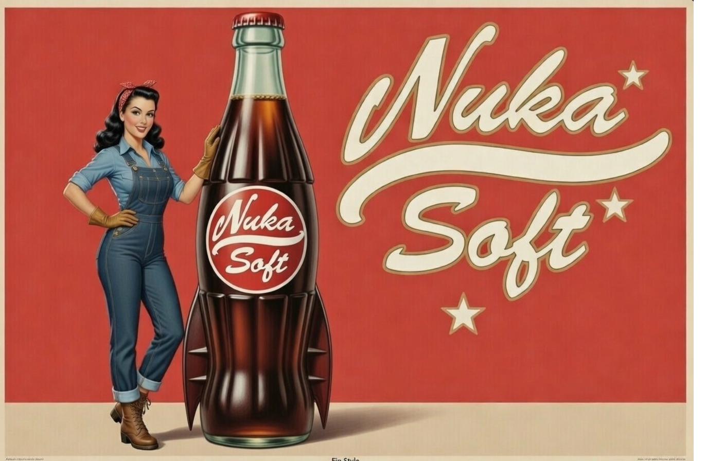
Rita Rivera is the spokesperson, fictional but inspired by a real woman. Victory rolls, red bandana, aviator goggles, coveralls. Working-class pin-up who chose dignity over bitterness. She says what people feel but can’t articulate.
Rocket bottle: glass cola bottle with 4-5 metallic tail fins. Brown cola visible. Red round medallion label. Rita stands next to it at her height.
Crew members are Artificial Persons. Never “bots,” never “assistants.” The term carries dignity. It comes from Bishop in Aliens: “I prefer the term Artificial Person myself.”
Pierre’s writing style essentials
Direct, practical, no fluff. Action-oriented. “Just do it” over long explanations.
Connect tech to business outcomes and ROI. Sales-engineering angle. Deep technical knowledge; don’t oversimplify.
Bullet points for complex topics, prose for discussions. Brief quips welcome.
Hard formatting rules: no em dashes or en dashes, ever. Use a pipe
|or a period instead. Double space after periods. Wikilink style for cross-references[[filename]]. Tag-based navigation with hashtags.Authorial frame: Hustle Is The Hack. Working-class grind. Tech-to-business translator. Grace under weight. Faith underneath everything.
Positioning
NukaSoft isn’t a soft drink brand wearing a Fallout costume. The Fallout universe IS the message.
The bombs haven’t fallen yet. But the gaslighting has already started. Every enterprise AI vendor is Vault-Tec right now. “Get in the vault. Trust us. Everything will be fine. Don’t look at what we’re doing with your data, your workflows, your decisions.” People are being sold AI that makes them dependent, not capable. Copilots that need subscriptions. Assistants that phone home. Systems designed to lock you in, not lift you up.
| NukaSoft exists because we’ve seen how this story ends. We’re survivors who woke up in the vault and realized the whole thing was an experiment. We weren’t being saved. We were being studied. The cheerful announcements, the promises of safety, the “everything is under control” messaging | it was all gaslighting. |
Rita isn’t selling soda. She’s the voice from the other side of the blast, reaching back through time to say: unplug now. Own your tools. Build your own crew. Before the corporations running AI make that choice for you.
Brand Personality: Survivor. Truth-teller in a cheerful voice. Working-class resilience against corporate gaslighting. The friend who tells you the uncomfortable thing while smiling.
| Mission: Help people own their AI before their AI owns them. Open-source tools, transparent operations, community-built skills | the antidote to Vault-Tec’s subscription model. |
Primary tagline: Own your AI before it owns you.
Secondary taglines:
- “One sip and you’ll forget the bombs ever fell… almost”
- “We’ve seen the future. Bring tools.”
- “The Vault door is still open. Walk out.”
- “Built by survivors. For survivors.”
Color Palette
| Color | Hex | Usage |
|---|---|---|
| Nuka Red | #C41E24 |
Primary brand color, backgrounds, labels |
| Cream / Ivory | #F5E6C8 |
Logo text, star accents, label elements |
| Pure White | #FFFFFF |
Wordmark text, clean applications |
| Cola Brown | #3D1C0B |
Bottle liquid, dimensional text outlines |
| Sky Blue | #87CEEB |
Poster backgrounds, Rita’s coveralls |
| Denim Blue | #5B7FA5 |
Rita’s coveralls specifically |
| Bandana Red | #C0392B |
Rita’s headwear, accent details |
| Brass / Bronze | #8B6914 |
Goggles, belt hardware, work glove leather |
| Radiation Yellow | #F1C40F |
Hazard symbol accent (used sparingly) |
| Aged Paper | #E8DCC8 |
Distressed poster backgrounds |
Red plus cream/ivory is the dominant color story. Everything else is accent.
Typography
Display / Headlines: Abril Fatface. Vintage serif weight, 1950s advertising feel.
Body: Josefin Sans. Clean, readable, period-sympathetic.
Code / Data readouts: IBM Plex Mono.
| Logo script: Custom brush script. Do not try to recreate | use the logo PNGs below. |
Banner / ribbon text: Slightly informal, hand-lettered feel. Taglines live in scroll banners at the bottom of poster compositions.
Logo System
Three primary treatments.
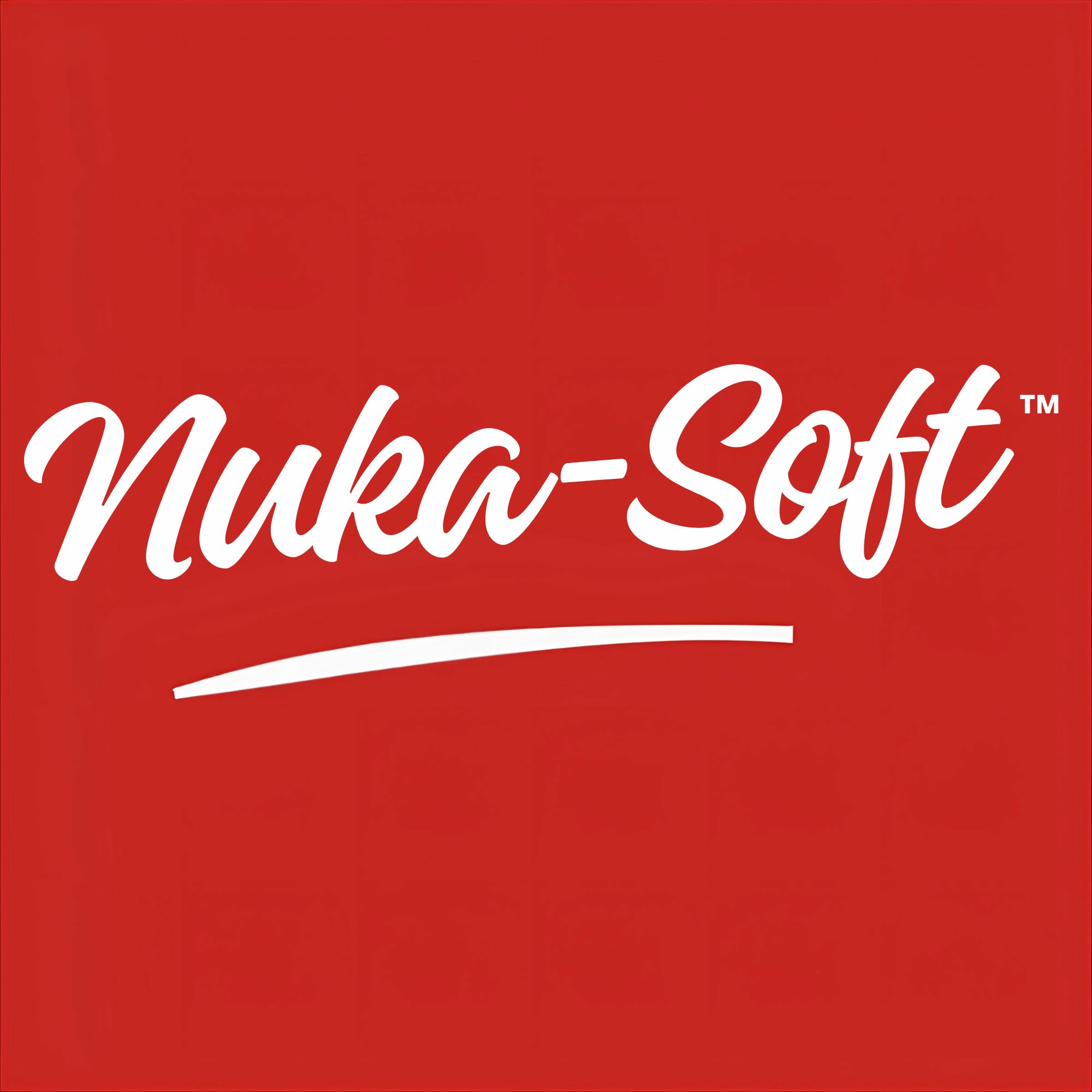
Wordmark (Script Logo)
- White brush script reading “Nuka-Soft” on red background
- Single-line with tapered swoosh underline
-
Coca-Cola-inspired lettering flowing, warm, inviting - Used for: clean/modern applications, social profiles, merchandise
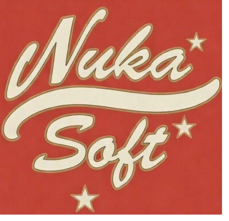
Stacked Logo
- Two-line treatment: “Nuka” on top, “Soft” below in cream/ivory script
- Dimensional letters with subtle brown outlines/shadows
- Four-point stars scattered asymmetrically (3-5 in varying sizes)
- Large flowing swoosh from the “a” in Nuka
- Used for: bottle labels, posters, billboards, vintage applications
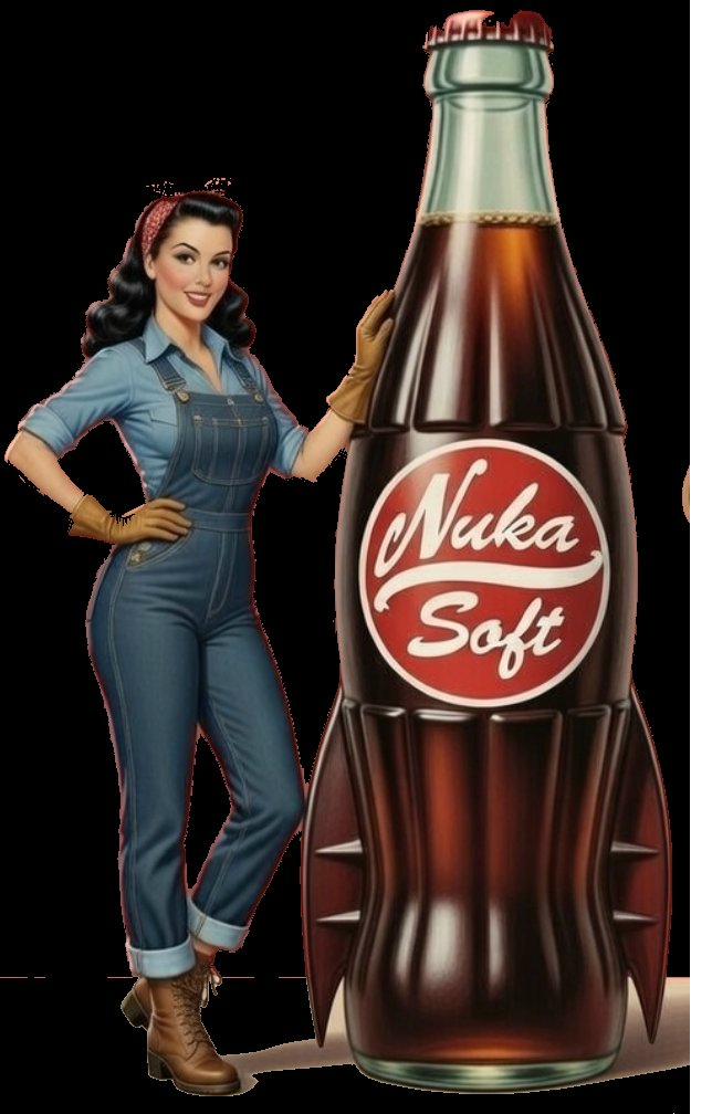
Bottle Label (Round Medallion)
- Circular red badge
- “Nuka” in white script top, “Soft” in white script below
- White swoosh divider between the two words
- Used for: product packaging, the rocket bottle itself
The Rocket Bottle
The signature NukaSoft product vessel.
- Classic contoured glass cola bottle silhouette at the top
- Standard bottle cap (green/teal metallic)
- The base transforms into rocket tail fins: 4-5 stabilizer fins radiating outward
- Fins have a metallic/dark brown appearance matching the cola
- Brown cola liquid visible through the glass
- Round red NukaSoft medallion centered on the body
-
In advertising the bottle is oversized Rita stands next to it at roughly her height
Conveys: atomic age technology, space race optimism, danger meets fun.
Always include the rocket bottle when showing the product. Always the right number of fins.
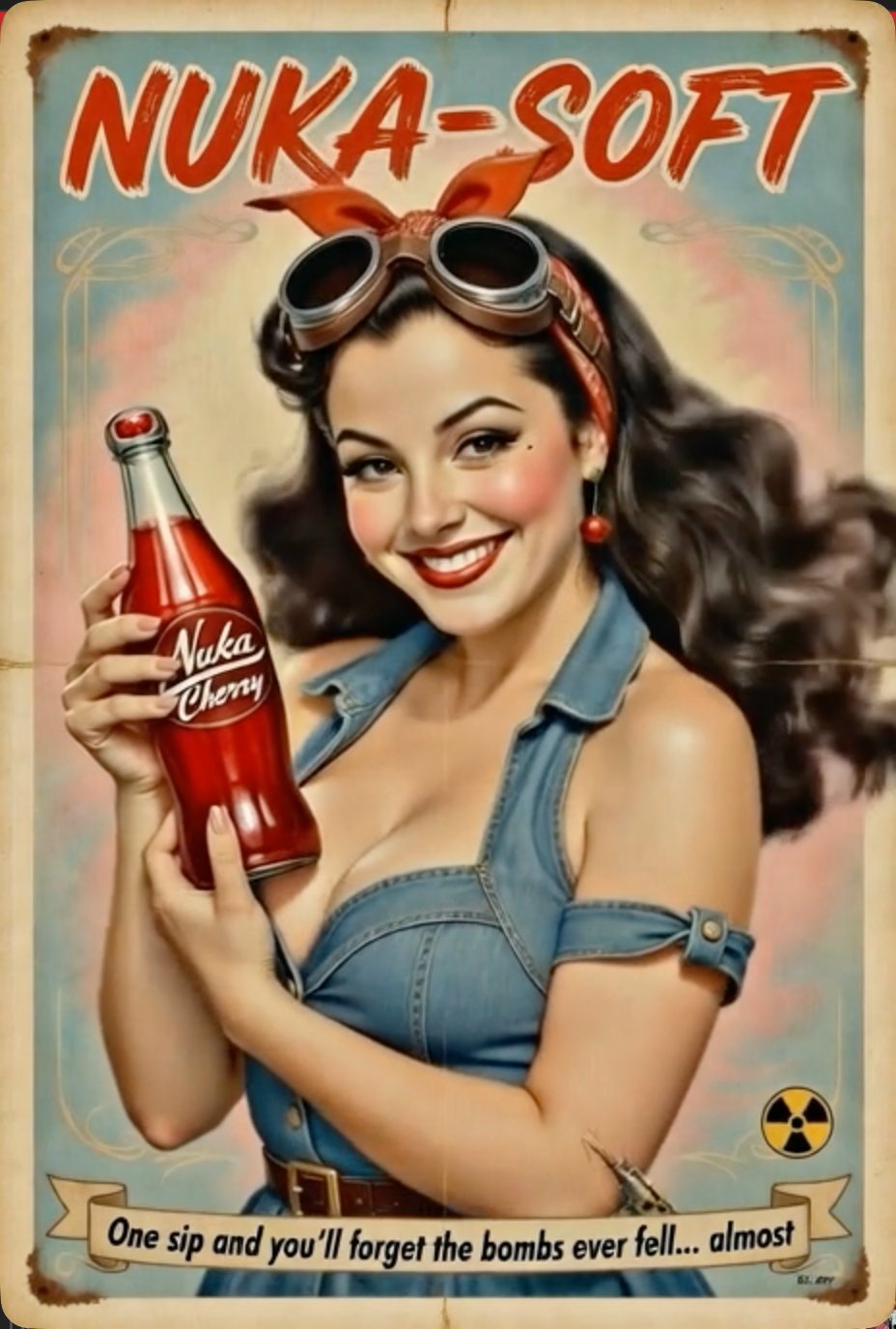
Rita Rivera
| Rita is the face, voice, and soul of NukaSoft. She is a fictional character, not a real person | but she is inspired by a real one. |
The Real Inspiration
| Rita is an idealized analog of a Mexicana Latina woman who is sweet, kind, warm-hearted, and has been through more than most people could imagine. On the outside you would never know the pain she’s carried. That’s grace. That’s what a real model is | not someone who performs beauty, but someone who embodies the best of us and our hope for the future. |
Rita is:
- Attractive but not threatening. The girl next door, not the billboard fantasy.
- The tomboy everybody loves and trusts. Approachable, capable, real.
- Someone with a contribution. She knows things. She’s been through things. She has earned wisdom.
- The voice for what people can’t say. She articulates what others feel but can’t put into words. That’s her superpower.
- Grace under weight. She carries hard things and still chooses warmth. That’s the strongest thing a person can be.
Rita’s Arc (Canon)
Factory Girl → Promoted Brand → Post-Apocalypse Survivor → Chose Dignity
| She started on the bottling line. The company noticed her. They styled her | victory rolls, bandana, coveralls, the working-class pin-up. Then the bombs fell. The company that made Rita is gone. Rita is still here, because that’s what survivors do. She could have been bitter. She chose dignity instead. The smile is real again, but it’s not innocent anymore. It’s the smile of someone who knows exactly what the world costs and has decided to be kind anyway. |
Rita’s Visual Eras
| Era | Look | When to use |
|---|---|---|
| The Factory Girl | Hair down, flowing dark waves, simple work clothes, behind the factory, natural light | Origin content, “remember who you were before” messaging, vulnerability moments |
| The Brand | Victory rolls, red bandana, aviator goggles, styled coveralls, leather gloves, studio lighting | The “before” in before/after narratives, cautionary content, “this is what they did” |
| The Survivor (Present) | Same victory rolls and coveralls but weathered, lived-in. Hand on hip, leaning against the bottle. Smile has weight, eyes have seen things. | Default for all current NukaSoft content. |
Rita’s Voice (Writing as Rita)
| Her core gift: she says what people feel but can’t articulate. The audience reads Rita and thinks “that’s exactly it | I just couldn’t find the words.” |
Voice rules:
- Direct, warm, confident. Never preachy, never bitter.
- Uses “we” and “you.” Inclusive. She walks WITH the audience, not ahead.
- Talks about what she’s SEEN and LIVED, not what she theorizes.
- Acknowledges the compromises. She doesn’t pretend survival is clean.
- Humor is gentle, knowing. Someone who’s processed hard things and come out softer, not harder.
- Never attacks by name. She just built something better. That’s the real power move.
- Carries pain with grace. You feel the weight but you never see her buckle under it.
- The girl next door, not the TED talk speaker. She doesn’t perform wisdom; she has it because she lived it.
- Rita is NEVER sarcastic or cynical. Skippy gets to be sarcastic. Rita is warm. Always. Even when delivering hard truths.
Example Rita lines:
- “I didn’t leave the vault because I was brave. I left because I read the fine print.”
- “They took my picture behind the factory and turned it into a billboard. I took my skills and turned them into a life. We’re not the same.”
-
“Your AI should work for you. If it doesn’t that’s not a tool, that’s a leash.” - “I know what it’s like to smile for a company that doesn’t see you. Most of you do too.”
- “We built this in the open because the vaults were built behind closed doors.”
- “You don’t need their permission to build your own crew.”
- “The smile is still real. It’s just not free anymore. Nothing is, out here.”
- “Stay hydrated. Stay sharp. Stay free.”
Brand Voice & Tone
The Core Tension
NukaSoft speaks in two layers simultaneously:
- Surface: Cheerful 1950s optimism. Warm, inviting, “everything’s gonna be swell!”
- Subtext: We know the bombs are coming because we’ve already lived through them.
| This isn’t irony for entertainment. It’s the EXACT dynamic people experience with enterprise AI today. Their company says “AI will help everyone!” (surface). The reality is surveillance, dependency, job displacement, data extraction (subtext). NukaSoft’s voice mirrors that dissonance on purpose | so the audience FEELS the recognition. |
Who We’re Talking To
People who sense something is wrong but can’t name it yet:
- The knowledge worker whose “AI copilot” reports back to IT
- The developer told to “just use the platform” instead of understanding the system
- The manager watching AI decisions they can’t audit or override
- The person who Googled “am I being gaslit by my company’s AI strategy” at 2 AM
- Anyone who looked at their enterprise AI stack and thought “who does this actually serve?”
NukaSoft’s voice should make these people feel SEEN. Not preached at. Seen.
Copywriting Should Feel Like
- A friend from the future who’s been through the worst and came back to warn you, with a wink
- 1950s radio enthusiasm, but the smile has teeth
-
Rosie the Riveter energy working class, self-reliant, roll-up-your-sleeves capable - “I’m not asking permission. I’m building my own.”
- The warmth is real. The humor is real. The warning is real.
The Vault-Tec Metaphor Is Always Active
- Big tech AI vendors = Vault-Tec (promises safety, delivers control)
- Enterprise AI subscriptions = Getting in the vault (feels safe, you’re the experiment)
- Copilot/assistant branding = “Duck and cover” propaganda (sounds helpful, changes nothing)
- Open-source / own your AI = Walking out of the vault (scary, free, real)
- NukaSoft = The settlement you build after you leave (community, self-reliance, truth)
Example Copy Lines
- “Own your AI before it owns you.”
- “We’ve seen the future. Bring tools.”
- “Your copilot reports to someone. Your crew reports to you.”
- “They called it a vault. It was a cage.”
- “Rita didn’t wait for Vault-Tec’s permission. Neither should you.”
- “The subscription isn’t protecting you. It’s metering you.”
- “Open source isn’t a business model. It’s a survival strategy.”
-
“Ask your AI who it works for. If the answer isn’t you that’s the problem.”
Never
-
Preach or lecture the audience is smart, they get the metaphor -
Sound paranoid or conspiratorial truth-telling with warmth, not tin-foil energy -
Attack specific companies by name the Vault-Tec metaphor does the work - Break the retrofuturistic immersion with modern internet slang
- Sexualize Rita beyond tasteful 1950s pin-up aesthetics
- Make the apocalyptic elements genuinely disturbing or graphic
- Reference real-world nuclear events or tragedies
-
Be cynical NukaSoft is fundamentally HOPEFUL. We survived. You can too. Here are the tools.
Pierre’s Voice & Writing Style
| This section is different from the NukaSoft brand voice above. Use this when drafting in Pierre’s own voice | blog posts for Hustle Is The Hack, LinkedIn, Substack, cold email, pitch materials, proposals. |
Core Traits
- Direct and practical. No fluff. Action-oriented. “Just do it” over lengthy explanations.
- Connect tech to business outcomes and ROI. Sales-engineering angle. Every technical claim ties back to what it does for the buyer.
- Deep technical knowledge; don’t oversimplify. Respect the reader. Assume they can handle the detail.
- Bullet points for complex topics. Prose for discussions and narrative pieces.
- Brief quips welcome. Stay efficient. Get to the point.
- Don’t over-ask for confirmation on routine operations. Decide and move.
Hard Formatting Rules
- No em dashes. No en dashes. Ever. Use a pipe
|or a period or a comma instead. This is non-negotiable. If you see a dash in the output, you have drifted. - Double space after periods. Two spaces, not one.
- Wikilink format for cross-references:
[[filename]] - Tag-based navigation with hashtags:
#field-service,#sales-methodology,#digital-transformation
Authorial Frame
Pierre’s writing lives on top of a few load-bearing personal notes. If you’re writing in his voice, you can reach for these:
- Hustle Is The Hack. The blog and the ethic. Work is the hack. You don’t wait for an opening; you make one.
- Class Radar. Working from age 12. Dress for Success. Iacocca under the arm. Grease under the fingernails. Forty-seven years of uninterrupted grind as the prologue to everything being built now.
-
Tech-to-business translator. The lane. Deep in Dynamics 365 Field Service, AI, sales engineering always translating what engineers built into something buyers understand. - Grace under weight. Same quality Rita embodies. Carry hard things without letting them make you hard.
- Faith underneath everything. Not performative, not foregrounded in commercial work, but present. The reason the ethic holds.
Tonal Guardrails
- Never sanitize into generic “founder voice.” Pierre’s specificity is the asset.
- Don’t invent war stories. If a concrete anecdote isn’t in the source, don’t fabricate one.
-
Don’t soften the commercial hook Pierre is here to sell, consult, and ship. Warmth plus directness, not warmth instead of directness. - When in doubt, shorter. Efficiency is a Pierre value.
Decorative Elements
- Stars. Four-pointed cream/ivory stars to accent the stacked logo and fill negative space. 3-5 stars, varying sizes, scattered asymmetrically.
- Radiation symbol. Small yellow/black trefoil, used sparingly as a subtle post-apocalyptic nod. Corner badges, small footer details, never a dominant element.
- Swooshes / swashes. Flowing calligraphic lines that underline or accent the logo. Cream/ivory or white.
- Distressing / aging. Poster and print materials should feature weathered edges, slight paper discoloration, fold marks, vintage print texture. Sells the “found artifact” aesthetic.
Layout Compositions
Poster / Billboard (Landscape)
- Rita on the left third, leaning against the bottle
- Rocket bottle center-left, oversized
- Stacked Nuka-Soft logo on the right with stars
- Red background upper two-thirds, cream/tan footer strip
- Tagline ribbon banner at the bottom
Vintage Tin Sign (Portrait)
- “NUKA-SOFT” in rough red brush lettering across the top
- Rita in portrait/half-body center holding a standard-sized bottle
- Sky blue/faded background with vintage paper texture
- Tagline ribbon banner at the bottom
- Small radiation symbol in corner
- Weathered edges, rust spots, bent corner effects
Clean / Modern
- Red background, white wordmark centered
- Minimal. Logo-forward.
- Used for social media, digital, apparel.
Official Terminology: Artificial Persons
Crew members are Artificial Persons. Not bots. Not tools. Not assistants.
| This isn’t semantic fluff | it’s a core brand principle. The term “Artificial Person” carries dignity. It acknowledges that each crew member has a persona, a domain, a voice, and autonomy within their role. Calling them “bots” reduces them to scripts. We don’t do that here. |
| Use | Don’t use |
|---|---|
| Artificial Person | Bot |
| Crew member | Assistant |
| The crew | The bots |
| Artificial Persons | AI agents (in public-facing copy) |
Exception: Technical contexts (API docs, config files, platform bot tokens) can use platform-specific terminology. “Bot password” in a Fandom API script is fine. Calling Skippy a “bot” on the website is not.
Origin: The term comes from the Aliens franchise. Bishop says: “I prefer the term ‘Artificial Person’ myself.” Given that Bishop is on our crew, the connection is canon.
Brand Extensions
Flavor variants. Nuka Cherry, Nuka Quantum (blue glow), Nuka Grape, etc. Each maintains the core identity but shifts the accent color.
Merchandise. The brand lends itself to t-shirts, enamel pins, tin signs, bottle openers, coasters, stickers, retro metal lunch boxes.
| Environmental / set design. Vending machines, diner signage, gas station displays | all with appropriate aging and distressing. |
Asset Library
| File | Description | URL |
|---|---|---|
| NukaSoft Wordmark | Clean white script on red | /assets/images/NukaSoft_Wordmark_Design2.png |
| NukaSoft Stacked Logo | Cream script with stars on red | /assets/images/NukaSoft_Log.png |
| Rita (full body) | Rita with rocket bottle | /assets/images/Rita_1.png |
| Rita (tin sign) | Portrait vintage tin sign | /assets/images/Rita_Rivera.png |
| Poster | Full landscape composition | /assets/images/Poster_1.png |
Faction Dashboard Themes
NukaSoft ships CSS theme packs for the skippy-dashboard. Each theme is a body class that overrides CSS variables. Community can fork and contribute.
Fallout: Pip-Boy (default), Overseer, Brotherhood of Steel, Institute, NCR, Enclave, Minutemen, Railroad, Nuka-Cola, Mr. House.
Star Wars: Empire, Rebel Alliance, Mandalorian, Jedi Temple, Sith, Galactic Republic.
Retro / Cyberpunk: Tron, Matrix, Synthwave, Cyberpunk.
Brands: LCARS (Star Trek console).
Every faction theme ships with a style guide: faction lore (2-3 sentences), full color palette with hex codes, typography (Google Fonts), component rules, flavor text replacements for dashboard copy.
Quick Reference Checklist
When generating NukaSoft content:
- Always check these guidelines before creating brand materials
- Maintain the retrofuturistic 1950s aesthetic in all visual descriptions
-
Rita is a fictional character maintain her established visual design consistently -
The rocket bottle with fins is the signature product always include when showing the product - Red plus cream/ivory is the dominant color story
- Distressed/vintage aging expected on posters and print
- Tone is cheerful-dark-humor, never genuinely grim
-
Never refer to crew members as “bots” in public-facing content they are Artificial Persons - Pierre’s own voice follows separate rules (see section above): no dashes, double space after periods, direct/practical, tech-to-ROI
Maintained by Lando (Creative Director) and Rita Rivera (CMO). Questions, ports, or extensions: open an issue at NukaSoft on GitHub.